
NBA Cap Sheets 2025/26
An interactive visualization for exploring the salary-cap situation of all 30 NBA franchises.
Challenge
The NBA's salary structure is one of the league's most complex dimensions. Understanding each franchise's room to operate requires more than looking at individual salaries: contracts, future commitments and different financial thresholds need to be organized in a structure that makes it possible to quickly compare teams with very different situations.
The challenge of this project was to turn that dense set of information into a visualization that could work both as a reference and as an exploration tool, lowering the barrier for readers who follow the NBA without necessarily mastering every detail of its financial structure.
Solution
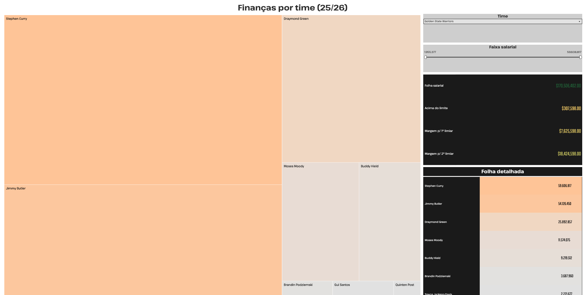
I developed a Tableau visualization covering all 30 franchises, organizing the data consistently so users can explore and compare different salary sheets within the same visual language. The structure prioritizes quick reading, information hierarchy and team-to-team comparison while keeping financial values connected to their respective players and franchises.
Using an interactive interface allows a volume of data that would be difficult to absorb in a conventional table to be explored more intuitively. The project combines sports research, data organization and information design to make a technical subject more accessible to people who follow the league.
Impact
The result was a visual reference tool for following franchise finances throughout the 2025/26 season. Rather than presenting numbers in isolation, the project offers a structured and comparable view of salary sheets across the entire league.
Within my portfolio, the work directly represents the intersection of two central areas of my career: specialized basketball knowledge and the ability to turn complex data into understandable visual information.
My role
I researched and organized the financial data used in the project and was responsible for designing and building the Tableau visualization, including its structure, visual hierarchy and exploration experience.
Visualization elements
30 franchises
A common structure makes it possible to explore and compare salary sheets across every NBA team.
Interactive exploration
The Tableau visualization turns an extensive financial dataset into a direct exploration experience.
Team comparison
A standardized visual structure makes differences in financial composition and roster construction easier to identify.
NBA finances
The project translates a technical aspect of the league into visual information for basketball readers and fans.